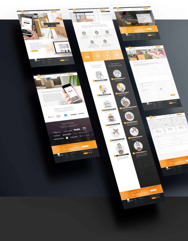
Since 2003, International Checkout has been connecting retailers with international consumers. With brand equity in mind, I redesigned their website with a focus on usability and functionality. The logo was also redesigned to be more modern, clean and simple.
Website Design and Development
Custom Iconography & Process Flow
Logo Style Guide
The International Checkout logo was carefully crafted to be unique for the brand. This is the primary logotype, which should be used in most circumstances. The logotype is primarily set in an orange container which adds cohesion to the various shapes. The letters are comprised of modern, clean and simple shapes that are both visually distinct and easy to read. The intersection between the two letters creates a negative space which adds detail and interest. The combination of all of the elements creates depth which draws the viewer in.
Careful attention was given to the logo, the logotype, and the space around it.
Careful attention was given to the logo, the logotype, and the space around it.