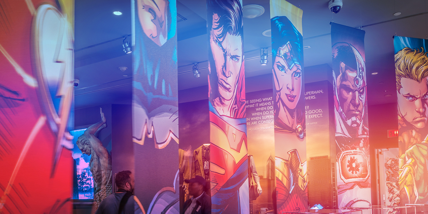
Your logo is the face and personality of your business. It should be the mark that represents what your company stands for. As such, you need to ensure that you work with reputable designers. You don’t need to be a designer yourself, but by understanding what makes a logo effective, you will have confidence working with a designer and be able to evaluate the designs and provide constructive feedback. Here are characteristics of a good logo.
1. SIMPLICITY
The best logo is often times the simplest one. It effectively conveys an emotion or idea without trying to say too much at once. Flat shapes, bold lines and clear type are hallmarks of effective logos. They never run the risk of appearing busy, confusing and hopefully not cliche. There are those that push a logo to convey as much meaning as possible. Not only is this unnecessary, in many cases it’s a distraction. Your logo shouldn’t be confusing or something for people to figure out. It should be a clean and simple icon to symbolize your organization’s personality and values. It should be easily recognizable, memorable and timeless. Let’s take a look at a few examples.
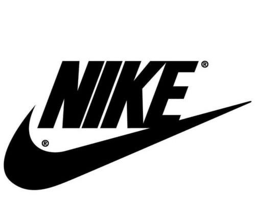
The Nike logo. It’s about as simple as a logo can get, but it’s iconic, timeless and unforgettable. The concept is rooted in Greek mythology. The Nike is the Winged Goddess of Victory. The swoosh is derived from the goddess’ wing, which symbolizes the sound of speed, movement, power and motivation.
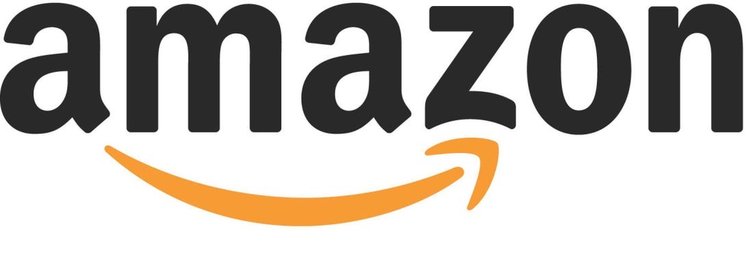
The Amazon logo was created to represent the message that it sells everything from A to Z (the arrow connects the two letters) and also represents the smile that customers would experience by shopping on the Amazon.com website (the arrow becomes a smile.)
The FedEx logo, at first, appears simple and straightforward. However, if you look at the white space between the “E” and “x” you can see a right-facing arrow. This “hidden” arrow was intended to be a subliminal symbol for speed and precision.
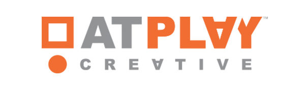
The At Play Creative log was intended to be fun yet mature. The concept is based on the first line from the famous Apple commercial narrated by the late Steve Jobs. “Here’s to the crazy ones, the misfits, the rebels, the troublemakers, the round pegs in the square holes…” The logo mark represents the round peg and the square hole. It represents creative people who “think different”.
2. VERSATILITY
An effective logo needs to be versatile so that it works in all contexts, media and applications. Here are a few points to consider when reviewing a logo. Your logo should work when seen as big as a billboard or as small as a postage stamp. Your logo should be readable in color and black and white. Some designers provide a vertical and horizontal version of the logo. Horizontal layouts work well in the header of a website or on a business card while a vertical logo might work in video or even a t-shirt. Will your logo still be clear and effective if it appears in a single color or on a black background instead of a white background? The best logo designers consider these factors and plan ahead. Your logo should also come with a style guide. This provides “instruction” for using your logo in various applications, across various channels.
- Readable at any size.
- Works in color and black and white.
- Logo works in a horizontal format.
3. RELEVANCE
The best logo design centers around a single attribute that is relevant to your prospects and your industry. The message should be relevant and resonant to your audience. A childcare center would likely choose a logo that is colorful and fun, while a law firm should consider a traditional logo with a confident color scheme. This may seem obvious, but it’s worth emphasizing because it is critical to your brand image. Again, consider the logos, above. They are all relevant to their industry and relevant to their audience.
Relevant also means your logo should be aligned to your business objectives, rather than your personal taste. Avoid unnecessary elements that may be visually pleasing but don’t support your message. Again, the Amazon logo supports the notion that they deliver everything … from A to Z and that the customer will be happy with their service. The Nike logo communicates victory and speed. The At Play logo represents creativity and uniqueness.
4. ARTISTRY
Ultimately a great logo is like a piece of art. Like all great art, it can instantly evoke feelings of joy, gratitude, anticipation or calm. It combines color, font, layout, and graphic elements into a visual that can communicate key attributes of your business, in a single glance. It takes real artistic talent to arrange these elements for maximum impact and influence in a way that allows for maximum flexibility in the application of the logo.
By evaluating a logo through each of these viewpoints it becomes easier to move the design of a logo into its ideal finished product.
DELIVERY:
Once you’ve approved your logo, you want to make sure the logo is delivered in all of the most commonly used file types so you don’t have to reach out to your designer, every time you want to use your logo in a different application. You should receive the following file types:
- Vector – .ai, eps
A vector file is the most flexible of them all. It can be used in almost any application. It can be scaled up and down without the loss of image quality and clarity. - High-resolution and low-resolution raster –
A raster file can be anything from a layered Photoshop document (.psd,) to an image with a transparent background (.png). Raster graphics, also called bitmap graphics, a type of digital image that uses tiny rectangular pixels, or picture elements, arranged in a grid formation to represent an image. Low resolution graphics are used on screen while high resolutions graphics are used in print. Low resolution is 72 dpi (dots per inch) while high-resolution is 150 dpi, or more. 300 dpi is very common. There is a lot more we could cover on resolution, but I won’t get into that, here. - Color and Black and white:
A logo should work in black and white as well as color. The color should be in both RGB and CMYK. These are modes for mixing color.. As a quick reference, the RGB color mode is best for digital work, while CMYK is used for print products. But to fully optimize your design, you need to understand the mechanisms behind each.
it’s great if your designer is also delivering a style-guide with your logo, but this is more of a “nice to have” best practice. A style-guide takes time and effort to put together. Most designers will charge extra for this deliverable. Depending on the cost, it’s probably worth it.